Simplifying the complexities of multi-tool content creation projects.
Introduction
In an era where content is king, seamless collaboration between brands and content creators is crucial. As the sole product designer at Brkaway, I worked on creating a comprehensive project management workflow that brings brands and creators together in one place.
Outcome
I ideated, iterated, collaborated with engineers, conducted usability tests, delivered high fidelity mockups, and delivered a web app solution that simplifies the content creation process between brands and content creators.
Role
Lead product designer
Timeline
2 years, on and off
Team
1 designer, 3 SWEs, 2 founders
Problem
Content creators and brands struggle managing projects with each another.
Brands and content creators have different processes and use a million different apps to manage their projects with each other. This makes it difficult to find project-related materials when it matters most, and also leads to an inefficient, overwhelming, and disorganized workflow.
User Research & Insights
Understanding how brands and creators work together.
I conducted interviews with 15 brands and 20 content creators. With this information, I created two customer journey maps to help our team understand their workflows and pain points.
The common thread was the struggle with managing multiple tools and the lack of a streamlined process for content creation projects.
The MVP
The initial designs and its challenges.
In the beginning, our team manually matched brands with creators based on their content needs and set up deliverables for them to work on together. This was a heavily manual process and didn’t solve our users core problem of multi-tool workflows.
Over the next 2 years, I would iterate on this flow many times and test with 20+ creators and brands to create a comprehensive workflow that saves our users thousands of hours.
Adding Projects & Deliverables
Allowing users to add and manage their own projects.
Initially, users couldn’t add their own projects or deliverables to Brkaway, making the platform highly restrictive. We wanted to allow users to manage any and all projects, so the first step was figuring out how to add this functionality.
Early explorations
I started with pen and paper to brainstorm some ideas quickly.
Iterations
Iteration #1: Project Wizard
To automate project-creation, this is a “smart” modal that asks users how many deliverables and what due dates are needed, then auto-generates a project for them. However, testing revealed that users found it difficult to discern how the project was getting created based on their inputs.
Iteration #2: Progressive Modal
The simplify the modal, I removed unnecessary questions and made it progressive. However, the progressive design made it feel like the process of adding a project was longer than it actually was, which felt frustrating for users.
Final designs
I simplified the questions asked on the modal further, which made project set up faster and easier.
Deliverable Stages
Facilitating the content creation workflow between brands and content creators.
At Brkaway, deliverables have 3 different stages: concept, content, and post. Concept allows users to brainstorm ideas for the content. Content allows creators to upload videos/photos and receive feedback from the brand. Post allows users to keep a log of where the content is posted (e.g., TikTok or Instagram links).
Initial designs
It wasn’t easy for users to understand what stage their deliverables were currently in. This was a problem because, for example, users couldn’t see they were in the concept stage, so they’d work ahead and create content without getting a concept first approved by the brand. So, how might we make it easy for users to understand their current deliverable stage so that they aren’t doing any guesswork?
Early explorations
I explored many different layouts to see how we could provide more clarity around the deliverable stages and what stage users were currently in.
Iterations
Iteration #1: Deliverable Timeline
The timeline was meant to show users the progression of a deliverable, but it was easy to miss and didn’t really give users insight into later deliverable stages.
Iteration #2: Expandable Deliverable Stages
User testing revealed that the expanding/collapsing interaction resulted in too much movement as users toggled between stages. It was also overwhelming to look at all deliverable stages at the same time.
Final designs
To simplify the interface and make it less overwhelming, I separated each deliverable stage into their own tab. This provides a focused view for each stage and allows users to toggle between the stages easily.
Content Revisions
Creating a comprehensive feedback cycle between brands and creators.
Revisions and feedback are important parts of the content creation process. Brands need to provide creators with feedback on concepts and content so that creators can iterate on the work.
Initial designs
If creators submitted multiple assets, brands could only approve or request changes on those assets as a whole. This was a problem because brands couldn’t provide feedback on a per-asset-basis. So, how might we allow brands to provide revisions on a per-asset-basis?
Early explorations
I explored many different layouts to see how we could provide more clarity around the deliverable stages and what stage users were currently in.
Iterations
Iteration #1: Bulk Actions
Bulk actions was meant to make it easy for users to bulk approve or request changes on assets submitted by creators. However, users requested the option to approve or request changes on individual assets.
Iteration #2: Expandable Deliverable Stages
User testing revealed that the expanding/collapsing interaction resulted in too much movement as users toggled between stages. It was also overwhelming to look at all deliverable stages at the same time.
Final designs
Creating a comprehensive revision process.
Usability Tests & Iterations
Testing and iterating on our proof of concept.
I conducted usability tests with 5 creators of varying levels of familiarity with the platform. My goal was to test clarity, completion, and comprehension of the new workflow.
Usability test results
Iterating on the usability test results
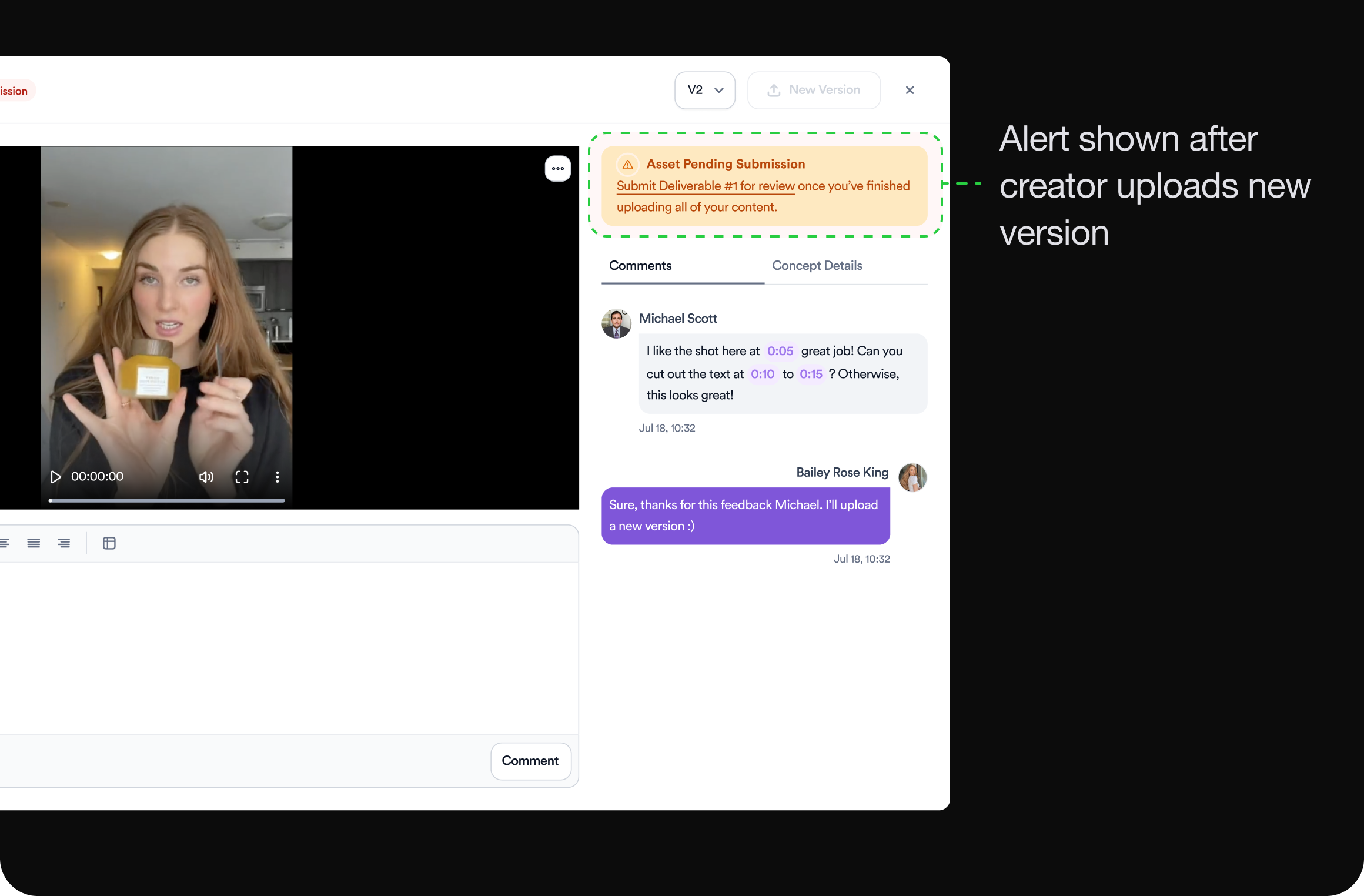
The biggest issue with the new flow was that creators weren’t sure what to do after uploading a new version of the asset. Did they need to submit the deliverable again? Could they just re-submit that asset for review? There was no clear path forward so I added an informative alert letting users know their next steps.
Before
After uploading a new version of an asset, several users weren’t sure what to do next.
After
I added an alert after users upload a new version indicating what they should do next. This helps guide them through the revisions process.
Final Designs
Putting everything together.
Through iterative design and a user-centered approach, we transformed a fragmented collaboration process into a cohesive, unified workflow. This project reinforced the importance of listening to user feedback and being willing to pivot. Moving forward, we’ll continue to monitor user interactions to refine the platform further.
Retrospective
Reflecting on the project.
There were lots of valuable learnings throughout this 2 year project.
User empowerment
Giving users control over their workflows increases engagement and satisfaction.
Clarity is key
Clear visualization of processes helps users navigate complex tasks.
Simplicity enhances usability
A simplified interface improves the overall user experience.